CSS Transitions made simple with Angular Animations
During the past few years, browser applications built with modern frameworks have been taking over the static, native applications we were used to use. The key of their success is the ability to disguise like system applications, emulating complex techniques like animations which they use to retain the consistency with other native applications. In this blog post we will learn how we can use Angular to write complex animations directly from our code, and we will learn their benefits over standard CSS transitions.
Angular... Animations?
Angular Animations are built on top of CSS animations to provide a native way to easily animate complex scenarios on Angular apps where the standard W3C CSS transitions fall short:
- Transitions between custom component states
- Complex animation of elements that are added and removed from DOM
- or, even the ability of executing code before and after an animation
Due to this kind of inheritance from standard W3C CSS transitions, every single animation we can think of on CSS is also doable on Angular Animations. As any other core component they live in their own module, BrowserAnimationsModule which you should import in your root application module if you're willing to use them.
Triggers, transitions and states
Let's start with some basic concepts that will help to understand how animations are built inside of Angular. We use component metadata to define triggers: the ones in charge of animating any change of state.
@Component({
  selector: 'app-root',
  templateUrl: 'app.component.html’,
  animations: [
    // animation triggers go here
  ]
})
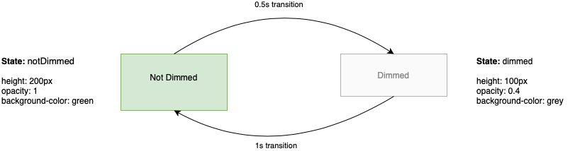
Each of the these triggers contains a key, used to invoke the trigger, and a set of states and transitions.
- A transition defines how a change between two diferent states should be animated
- We specify the final look and feel of each component within the state definition
animations: [
  trigger('dimBox', [
    state('notDimmed',
      style({ height: '200px', opacity: 1, backgroundColor: 'green' })
    ),
    state('dimmed',
      style({ height: '100px', opacity: 0.4, backgroundColor: 'grey' })
    ),
    transition('notDimmed => dimmed', [
      animate('0.5s')
    ]),
    transition('dimmed => notDimmed', [
      animate('1s')
    ])
  ])
]
If we want this simple transition to run, we must apply it somewhere. Angular animation triggers are meant to be used on the component template: they work like a directive we apply to the element we want to animate.
We use property binding to specify which is the current trigger state. Whenever this state changes the transition specified on the component's metadata is performed.
<div [@dimBox]="isDimmed ? 'dimmed' : 'notDimmed'">
  <p>{{ isDimmed ? 'Dimmed' : 'Not dimmed' }}!</p>
</div>
Asuming isDimmed exists as a property within our component, any change to its boolean value will trigger a transition between the two states we defined. To sum up:
Predefined states
The previous example made use of a set of states defined explicitly to trigger out a CSS transition, but that might be a bit cumbersome if we want to create an In and Out transition where the start and final state is the non-existence of an element.
To deal with these kind of edge cases Angular provides two useful predefined states we can use in our transitions:
- The wildcard state or
*, an alias that matches any possible animation state. - The void state or
void, which enables transitions for elements that are entering or leaving the page.
With a combination of these two states we can define transitions to animate the entering or leaving of a DOM element, like void => * or * => void. You can use them in its complete form or by its shortcuts: :enter and :leave.
animations: [
  trigger('inOut', [
    transition('void => *', [ ... ]),
    transition(':enter', [ ... ]),     // same as void => *
    transition('* => void', [ ... ]),
    transition(':leave', [ ... ]).     // same as * => void
  ])
]
Before writing further code there is a small thing to consider: since the wildcard and void are predefined states, we are not able to use them within our trigger to apply some initial styling like we did in our first animation. However, we can use the style function within transitions and animations to define both the initial styling and also the final one, after the animation has been performed.
animations: [
  trigger('inOut', [
    transition('void => *', [
      style({ opacity: 0 }),           // initial styles
      animate('500ms',
        style({ opacity: 1 })          // final style after the transition has finished
      )
    ]),
    transition('* => void', [
      animate('500ms',
        style({ opacity: 0 })          // we asume the initial style will be always opacity: 1
      )
    ])
  ])
]
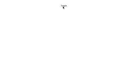
To use this trigger from our component template we just need to attach it to a component that might get removed or added to the DOM. As we don't have any explicit state, we just add it as a simple attribute.
<button (click)="isShown = !isShown">Toggle</button>
<div @inOut *ngIf="isShown">
  <img
    width="300"
    alt="Angular Logo"
    src="data:image/svg+xml;base64,PHN2ZyB4bWxucz0iaHR0cDovL3d3dy53My5vcmcvMjAwMC9zdmciIHZpZXdCb3g9IjAgMCAyNTAgMjUwIj4KICAgIDxwYXRoIGZpbGw9IiNERDAwMzEiIGQ9Ik0xMjUgMzBMMzEuOSA2My4ybDE0LjIgMTIzLjFMMTI1IDIzMGw3OC45LTQzLjcgMTQuMi0xMjMuMXoiIC8+CiAgICA8cGF0aCBmaWxsPSIjQzMwMDJGIiBkPSJNMTI1IDMwdjIyLjItLjFWMjMwbDc4LjktNDMuNyAxNC4yLTEyMy4xTDEyNSAzMHoiIC8+CiAgICA8cGF0aCAgZmlsbD0iI0ZGRkZGRiIgZD0iTTEyNSA1Mi4xTDY2LjggMTgyLjZoMjEuN2wxMS43LTI5LjJoNDkuNGwxMS43IDI5LjJIMTgzTDEyNSA1Mi4xem0xNyA4My4zaC0zNGwxNy00MC45IDE3IDQwLjl6IiAvPgogIDwvc3ZnPg=="
  />
</div>
The result is a nice fade in / out effect whenever the *ngIf is toggled.
The query selector
For now we have been directly targeting our transitions to the specific elements we want to animate by adding the trigger directive to them. Unfortunately, sometimes we need to perform custom animations that apply to inner elements that share the same parent.
The query selector allows us to target and react to all the changes within the element where the trigger is being applied. We can perform DOM queries or even use several matchers to watch for changes inside the parent element, such as :enter and :leave which will look for child elements that are being added or removed from the DOM.
Let's update our last example to make use of query selectors. We will add a small text to the previous template which we will try to animate separately from the Angular image.
<button (click)="isShown = !isShown">Toggle</button>
<div @inOut *ngIf="isShown">
  <img
    width="300"
    alt="Angular Logo"
    src="data:image/svg+xml;base64,PHN2ZyB4bWxucz0iaHR0cDovL3d3dy53My5vcmcvMjAwMC9zdmciIHZpZXdCb3g9IjAgMCAyNTAgMjUwIj4KICAgIDxwYXRoIGZpbGw9IiNERDAwMzEiIGQ9Ik0xMjUgMzBMMzEuOSA2My4ybDE0LjIgMTIzLjFMMTI1IDIzMGw3OC45LTQzLjcgMTQuMi0xMjMuMXoiIC8+CiAgICA8cGF0aCBmaWxsPSIjQzMwMDJGIiBkPSJNMTI1IDMwdjIyLjItLjFWMjMwbDc4LjktNDMuNyAxNC4yLTEyMy4xTDEyNSAzMHoiIC8+CiAgICA8cGF0aCAgZmlsbD0iI0ZGRkZGRiIgZD0iTTEyNSA1Mi4xTDY2LjggMTgyLjZoMjEuN2wxMS43LTI5LjJoNDkuNGwxMS43IDI5LjJIMTgzTDEyNSA1Mi4xem0xNyA4My4zaC0zNGwxNy00MC45IDE3IDQwLjl6IiAvPgogIDwvc3ZnPg=="
  />
  <h1> Angular </h1>
</div>
On the trigger definition we will modify the "in" transitions to feature different queries for the img and the h1 element. We will take advantage of this separation to stage when each of the items appear.
animations: [
  trigger('inOut', [
    transition('void => *', [
      query('img', style({ opacity: 0 })),
      query('h1', style({ opacity: 0 })),
      query('img', animate('500ms',
        style({ opacity: 1 })
      )),
      query('h1', animate('1000ms',
        style({ opacity: 1 })
      )),
    ]),
    transition('* => void', [
      animate('500ms',
        style({ opacity: 0 })
      )
    ])
  ])
]
The result is a nice fade in where the image apears first and then our newly added text.

This is not the only use-case of the query selector, most advanced and complex use cases include the animation of each of the Angular Router Transitions. Angular official docs include a page on this topic so feel free to check it if you feel curious about it.
Executing code before and after animations
Sometimes it might be required to run a piece of code before or even after our transition. Angular Animations also becomes handy for this purpose.
By listening to the start and done event you can call your own methods in the same fashion you already do for reacting to other Angular events. In the following example onAnimationStart and onAnimationEnd gets called before the animation is started and once it is finished.
<div [@dimBox]="isDimmed ? 'dimmed' : 'notDimmed'"
     (@dimBox.start)="onAnimationStart($event)"
     (@dimBox.done)="onAnimationEnd($event)">
  <p>{{ isDimmed ? 'Dimmed' : 'Not dimmed' }}!</p>
</div>
Closing thoughts
What you saw on this blog post is just an small fraction of what Angular Animations has to offer. Built over standard technologies, cross-browser compatibility and performance rests assured. You just shouldn't avoid to try them if you need to pack some transitions in your Angular app.
Don't forget to check the official docs on Angular Animations if you're eager to know more on them!