Customizing Lists With Angular Template References
In frontend applications, displaying lists of things is a very common requirement. This article shows you how to use Angular template references to give host components more control over the rendering of list items.
Introduction
We often write a list component and give it some data to render as items. But sometimes this is not enough. The host components suddenly need more control over how the items should be rendered. Arguably, the worst solution to this is extending the list component with more options for displaying the items and having the host control rendering through inputs to the list component. We would rather write the customizations close to where we render the list component, i.e. in the host component. React.js gives you that option through the render props pattern. In Angular, this pattern can be emulated, but it is not at all obvious how.
This post will take a deep dive into the concept of Angular template references, and show you how to give your host components full control over how the list items are rendered, while keeping the list component slim and unburdened by client logic.
A Real Use Case
In a project I was working on, I was recently faced with the challenge to wrap list items rendered from data by a library A, in a component that was provided by another library B. Library A provides a list component that renders items from data. Two separate applications use library A, but only one of the applications needs to wrap the items in a component provided by another library B. I wanted to avoid adding an otherwise unnecessary peer dependency to the other application and also keep the list rendering code clean from external business rules. Finally, the list only has to wrap some items, depending on their type.
A Contrived Example
To better demonstrate the problem and its solution, I created an example that shares the important characteristics of the actual use case.
Our little application will display a list of pet heroes with their names and their iconic pet hero animal sounds.
There is a pet-hero-list module which exports a PetHeroListComponent and renders a list of PetHero objects.
Let's see the code for it.
PetHeroListComponent in pet-hero-list/pet-hero-list
pet-hero-list.component.ts
import {Component, Input} from '@angular/core';
import {PetHeroData} from '../pet-hero-data';

@Component({
   selector: 'app-pet-hero-list',
   templateUrl: './pet-hero-list.component.html',
   styleUrls: ['./pet-hero-list.component.css']
})
export class PetHeroListComponent {
   @Input() petHeroData: PetHeroData[] = [];
}
pet-hero-list.component.html
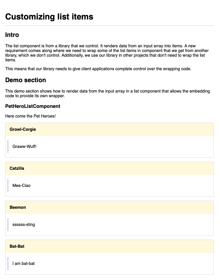
<h3>PetHeroListComponent</h3>
Here come the Pet Heroes!
<section class="pet-hero-list">
   <app-pet-hero-list-item *ngFor="let petHero of petHeroData" [petHero]="petHero"></app-pet-hero-list-item>
</section>
PetHeroListItemComponent in pet-hero-list/pet-hero-list-item
pet-hero-list-item.component.ts
import {Component, Input} from '@angular/core';
import {PetHeroData} from '../pet-hero-data';

@Component({
   selector: 'app-pet-hero-list-item',
   templateUrl: './pet-hero-list-item.component.html',
   styleUrls: ['./pet-hero-list-item.component.css']
})
export class PetHeroListItemComponent {
   @Input() petHero?: PetHeroData;
}
pet-hero-list-item.component.html
<section *ngIf="petHero" class="pet-hero-list-item">
 <h4>{{ petHero.species}}</h4>
 <blockquote>{{ petHero.soundBite }}</blockquote>
</section>
AppComponent
app.component.ts
import {Component} from '@angular/core';
import {PetHeroData} from './pet-hero-list/pet-hero-data';

@Component({
   selector: 'app-root',
   templateUrl: './app.component.html',
   styleUrls: ['./app.component.css']
})
export class AppComponent {
   petHeroData: PetHeroData[] = [
      {
         soundBite: 'Graww-Wuff!',
         species: 'Growl-Corgie'
      },
      {
         soundBite: 'Mee-Ciao',
         species: 'Catzilla'
      },
      {
         soundBite: 'ssssss-sting',
         species: 'Beemon'
      },
      {
         soundBite: 'I am bat-bat',
         species: 'Bat-Bat'
      }
   ]
}
app.component.html
<section>
   <h2>Demo section</h2>
   <p>This demo section shows how to render data from the input array in a list component that allows the
      embedding code to provide its own wrapper.</p>

   <app-pet-hero-list [petHeroData]="petHeroData"></app-pet-hero-list>
</section>
This is how many simple lists are being implemented and in most cases there is nothing wrong with that approach.
A New Requirement
However, we now have to implement a new requirement where each of the list items only reveal their content after users click on it. It would be best if this functionality was delivered by another component, so we don't bloat the list component further.
Keep in mind that in the actual application the PetHeroListComponent is provided by our own library A and the wrapper component is provided by library B.
We decide to implement a new ClickToRevealWrapperComponent in its own module that wraps the ng-content and hides it behind an overlay that will slide away after having clicked on it.
click-to-reveal-wrapper/click-to-reveal-wrapper.component.ts
import {Component, HostBinding, HostListener} from '@angular/core';

@Component({
   selector: 'app-click-to-reveal-wrapper',
   template: `<div class="overlay">
   Click to reveal. This wraps the content using ng-content.
</div>
<div class="content">
   <ng-content></ng-content>
</div>`,
   styleUrls: ['./click-to-reveal-wrapper.component.css']
})
export class ClickToRevealWrapperComponent {
   @HostBinding('class.revealed')
   revealed = false;

   @HostListener('click')
   clicked() {
      this.revealed = true;
   }
}
To try things out, we modify the PetHeroListComponent to directly use the wrapper component:
pet-hero-list.component.html
<h3>PetHeroListComponent</h3>
Here come the Pet Heroes!
The PetHeroListComponent now imports the ClickToRevealWrapperModule directly.
This adds an unwanted peer dependency to the library that exports the PetHeroListComponent.
<section class="pet-hero-list">
   <app-click-to-reveal-wrapper *ngFor="let petHero of petHeroData"
           class="item">
      <app-pet-hero-list-item [petHero]="petHero"></app-pet-hero-list-item>
   </app-click-to-reveal-wrapper>
</section>
Of course, we cannot ship the feature like that because other applications use the PetHeroListComponent, but don't want the click-to-reveal feature.
Invert the Dependencies
What we really want to do is to provide the host components a way to control the wrapping code of each of the list items.
In Angular, we can achieve this by passing a template reference to the PetHeroListComponent which will render the item inside the ClickToRevealWrapperComponent.
This is actually a form of dependency inversion, because the list component is able to use a template which it has no knowledge about.
Before, the AppComponent needed to know the PetHeroListComponent, which needed to know theClickToRevealWrapperComponent.
Now, the AppComponent will know both the PetHeroListComponent and the ClickToRevealWrapperComponent but they have no knowledge about each other.
This is not only required for us to avoid the additional library dependency, but good practice in general.
Using Angular Template References
To achieve our goals, we will make use of Angular Template References.
ThePetHeroListComponent will get a new @Input of type TemplateRef which holds a reference to the wrapper template.
pet-hero-list-item.component.ts
export class PetHeroListComponent {
   @Input() petHero?: PetHeroData;
   @Input() itemWrapper?: TemplateRef<unknown>;
}
Notice that we pass unknown as the generic type argument.
The list component does not make any assumptions about the type of template that comes in.
Using unknown is generally preferable to using any.
The itemWrapper input is optional, because we don't want to force host components to provide a wrapper if they don't need to customize the wrapping code.
Instead, we will provide a default wrapper template.
This is what the PetHeroListComponent HTML now looks like.
The default wrapper template simply renders the list item as is.
pet-hero-list-item.component.html
<h3>PetHeroListComponent</h3>
Here come the Pet Heroes!
The PetHeroListComponent now gets a template reference.
It will pass the template reference of each item to the wrapper.
<section class="pet-hero-list">
   <ng-container *ngFor="let petHero of petHeroData"
           [ngTemplateOutlet]="itemWrapper || defaultItemWrapper"
           [ngTemplateOutletContext]="{ $implicit: item, petHero: petHero}">
      <ng-template #item>
         <app-pet-hero-list-item [petHero]="petHero">
         </app-pet-hero-list-item>
      </ng-template>
   </ng-container>
</section>

<ng-template #defaultItemWrapper let-item>
   <ng-container *ngTemplateOutlet="item"></ng-container>
</ng-template>
For comparison, this is the old code:
<h3>PetHeroListComponent</h3>
Here come the Pet Heroes!
<section class="pet-hero-list">
   <app-pet-hero-list-item *ngFor="let petHero of petHeroData" [petHero]="petHero"></app-pet-hero-list-item>
</section>
This looks way more complicated than what we had before. Let's analyze what is actually going on.
- Rendering of the
app-pet-hero-list-itemis now wrapped inside ang-templateelement. The#itemon theng-templatewill create a template reference. This makes it possible to pass the item template around. - There is another
ng-templateat the bottom of the component template. This is the default wrapper template which will be used if no wrapper template is passed as an input. - The
*ngForwhich was previously on theapp-pet-hero-list-itemis now on ang-container. We pass theitemtemplate reference to the wrapper template. - Using the
[ngTemplateOutlet]directive, we tell Angular to render theitemWrappertemplate in place of the container. - Last, but not least, we use the
ngTemplateOutletContextdirective to give the wrapper template a reference to the list item template and the item data. The context is an object whose keys will be available for binding in the template'sletdeclarations. Note the use of the$implicitkey. Its value will be used as the default in anyletbinding that does not specify a key.
In this example both the<ng-container let-item let-petHero></ng-container>itemand thepetHerovariables would be bound to the$implicitvalue. In order to use a different key, we have to specify it:<ng-container let-item let-petHero="petHero"></ng-container>
The only thing that's left is to modify the AppComponent template to add the wrapping code and render the list items.
app.component.html
<app-pet-hero-list [petHeroData]="petHeroData" [itemWrapper]="itemWrapper"></app-pet-hero-list>

<ng-template #itemWrapper let-item let-petHero="petHero">
   <app-click-to-reveal-wrapper>
      <ng-container [ngTemplateOutlet]="item"></ng-container>
   </app-click-to-reveal-wrapper>
</ng-template>
The code that renders the list items must be put in yet another ng-template so it can be passed to the list component.
The item declared with let-item is the reference to the current list item template.
The code inside the ng-template just renders the item template within the app-click-to-reveal-wrapper.
Even though we don't use it in the template right now, the petHero variable is available as petHero and bound to the current PetHeroData object.
Finally, notice that we simply pass the itemWrapper template reference as an input to the app-pet-hero-list.
Wrapping Up
This blog post demonstrated how you can refactor your list components to allow more control over the rendering by the host component. Although maybe not as elegant as the React.js render props pattern, Angular template references are just as powerful and can be used very effectively in cases like the one described in this article.
In most cases, I would recommend decoupling the component rendering from the data by exposing both the list component and the list item component:
<app-list>
   <app-list-item *ngFor="let item of items" [item]="item"></app-list-item>
</app-list>
This pattern allows for easy wrapping and further customization of list items through slotted content.
But this is not always possible, e.g. when the code that renders the list items is not trivial and needs to be encapsulated in its own component.
For cases like that, the pattern I showed you in this post will hopefully help you out.
You can find the complete code example from this blog post in the GitHub repository.